New to BCome? Feeling a bit lost? No worries! Let’s give you a quick tour so you can start using your sustainability data effortlessly.
The platform is organized in 3 parts: sidebar, toolbar and the board. Now, let’s see the contents of each section, making it easy for you to find what you’re looking for:
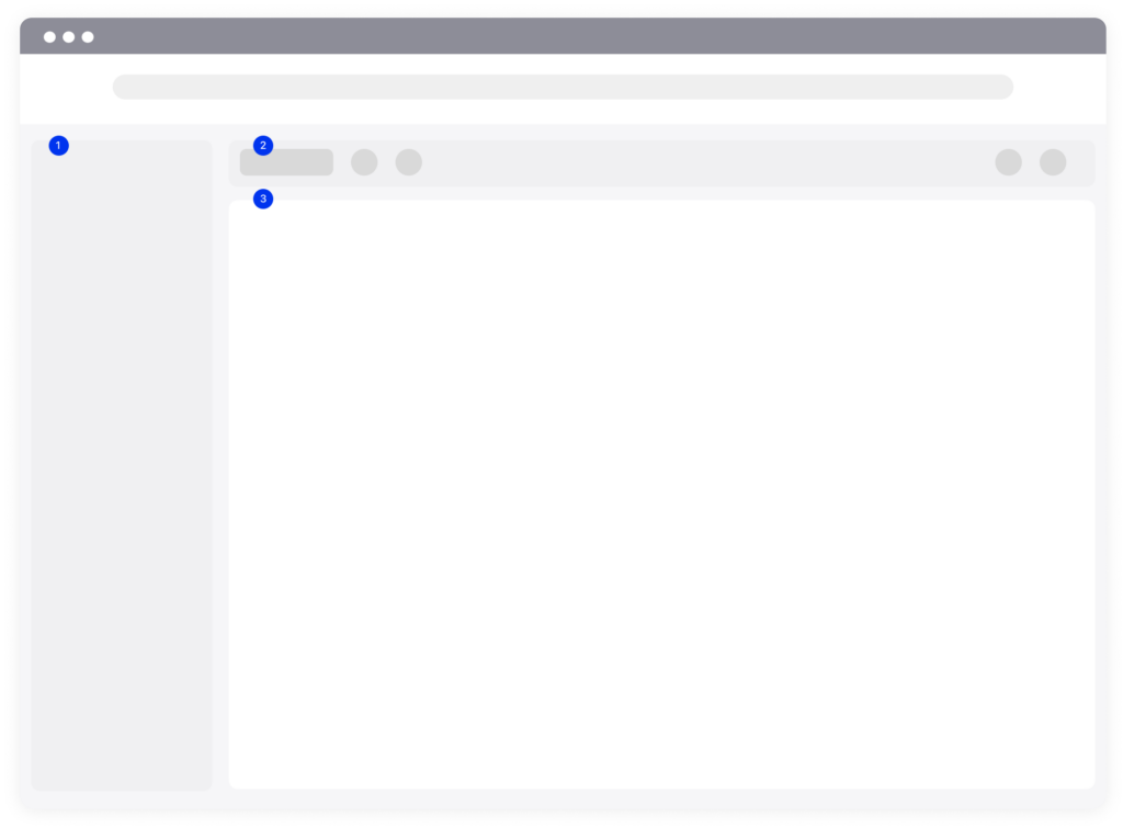
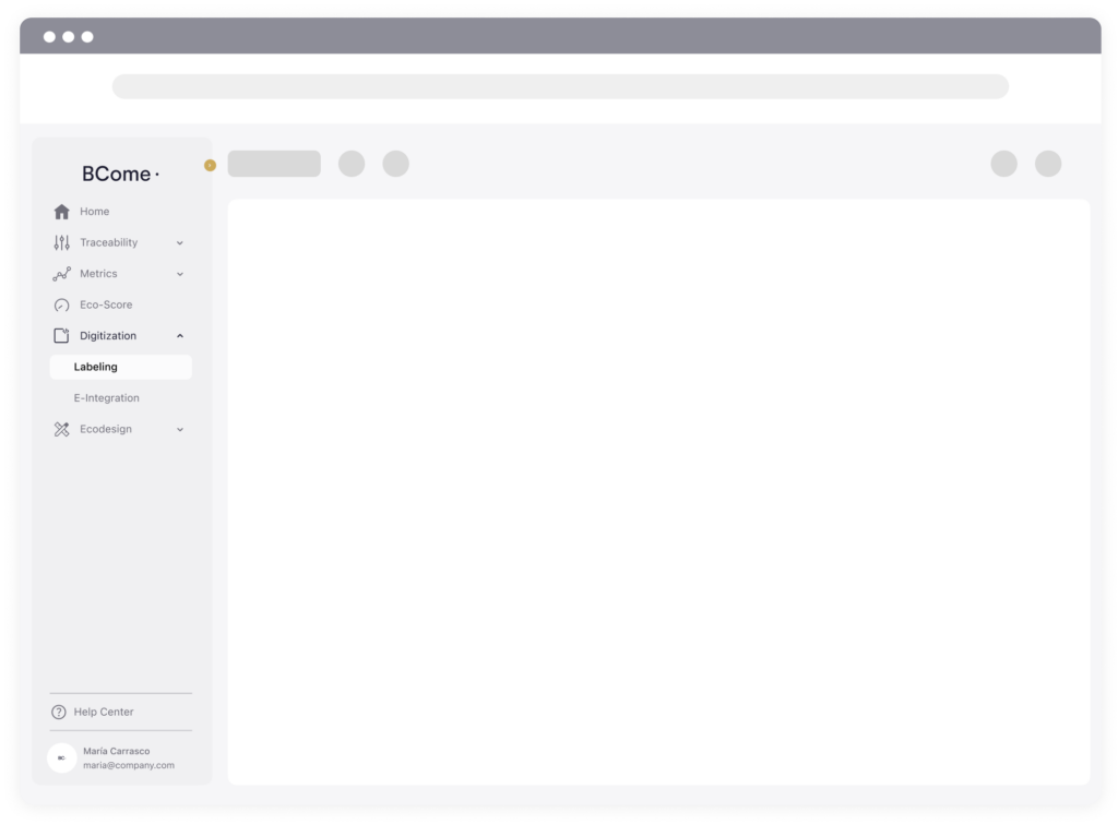
1. Sidebar
This is the main navigation point where you will find and select all BCome products and by-products.
- At the top, all products that require your data to be processed apply.
- At the bottom, you can adjust your profile preferences and also access the Help Center resources that will help you to understand your results.
If necessary, this sidebar can be hidden with the top arrow to make the canvas more visible. Your plan will determine what you can see in the sidebar, and what actions you can take.
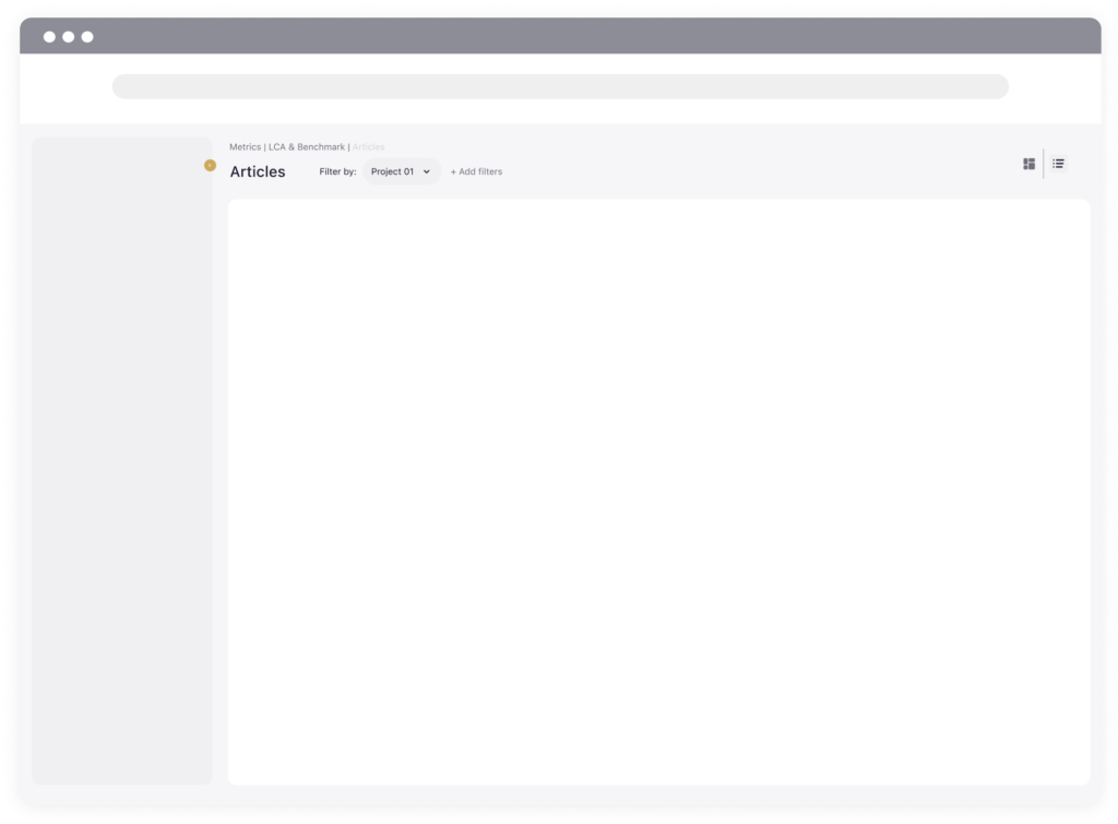
2. Toolbar
The toolbar is where you can access more information about your projects. Automatically, you will get the data of the last evaluated project. Select a project to view, narrow down your data through the filters, select the display mode, and then explore any results on the board.
- Project selector: Switch between projects to explore your collections, articles and categories.
- Add filters: Narrow down your results by specifying transport, category, finishings and more.
- Visualization mode: Check the preset views we have made for you or adjust your personal ones and access to them whenever you want.
3. Board
The board is where you’ll work and access data. It’s where you’ll spend most of your time, with plenty of space to explore and work on your articles.
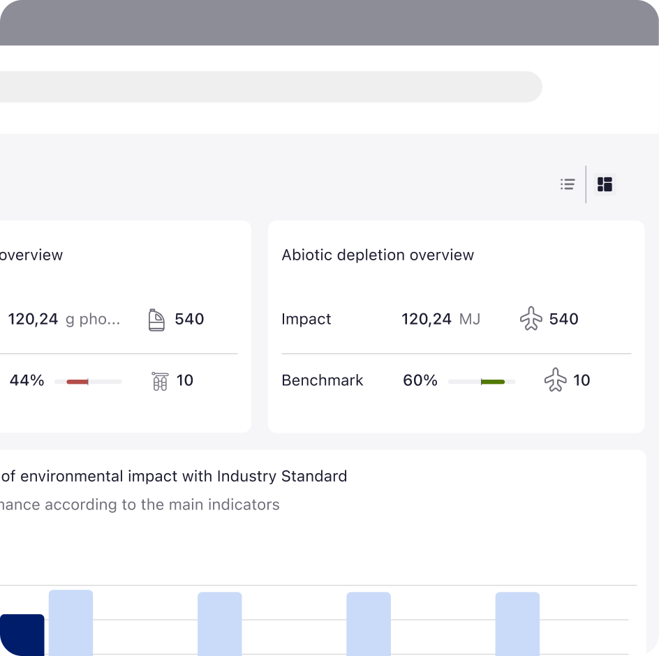
- If you have previously selected the dashboard view, this will allow you to see your project in a more visual way through graphs and will allow you to have an overview of your project.
- On the other hand, if you have selected the list view, you will be able to access your items individually and compare the information between them.
Dashboard view
The dashboard is made up of different modules that will show you different types of information: from top to bottom the information is organized from the most generic to the most specific.
👉🏻 Pan to move around. Don’t miss the ranking of the products that are always at the bottom of the dashboard.
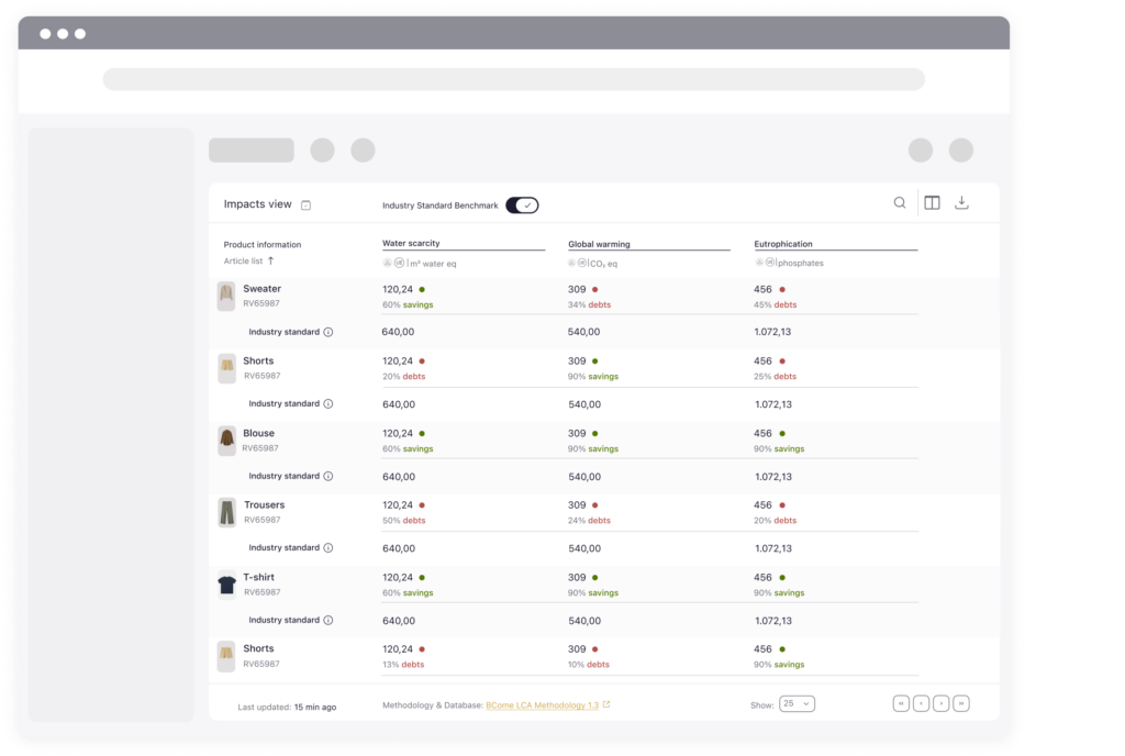
List view
The list is differentiated by three parts, the toolbar, the table and the footer.
The toolbar contains a selection of important tools and actions. There are three groups: view options, actions and collaboration.
- View options: Discover the two preset views that we have arrange for you or adjust the table editing, eliminate or clone. The changes you make here only apply to your view.
- Actions: Access data-level actions, like reference finder and toggle columns. You can then arrange those columns in the table to create your combinations.
- Collaboration: Download your data in CSV and share the file with your colleagues.
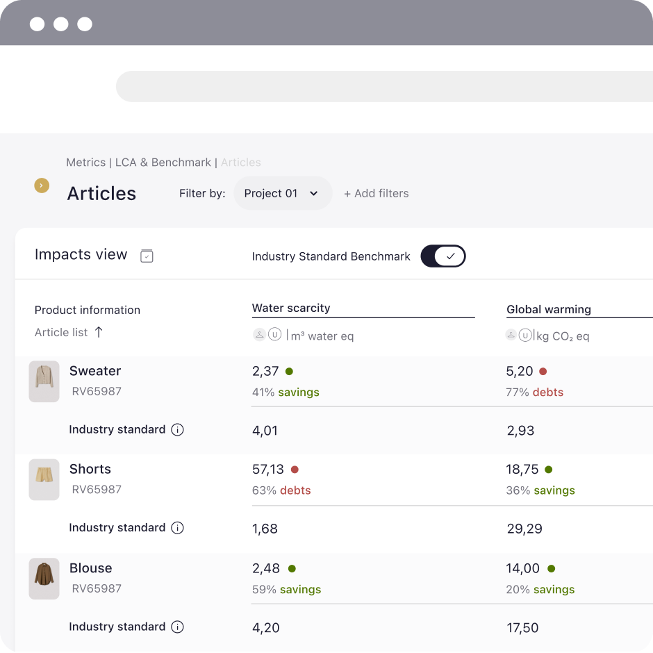
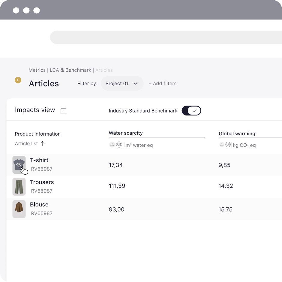
The table is where you can access more information about your articles. When you don’t have anything selected in the toolbar, you will view the impact preset views. If you want to see your results in a more everyday way, go to the view options and select the equivalence preset mode. With this view you will be able to see your results in a more tangible way. Sort the articles by clicking on the headers of each column, hover over the titles to learn more about the parameters and much more.
👉🏻 Want to go into more depth on a product? Click on its row and you will be taken to a one page summary of all products. Download the one page, compare your products and share it with other departments.
In addition, the footer gives you direct access to the methodology of the product you have selected and, it allows you to browse and organise your articles in 25, 50, 75, 100.
👉🏻 The more items you have uploaded, the longer the page will take. For this reason, we show only 25 projects at first.